Thursday, November 21, 2013

Beer redesign "Progress"

Main inspiration:

But type? I still don't know if I want pretty handwritten or strong sans serif?


Here's some terrible sketches of each.


Tuesday, November 12, 2013

Beer Bottle Redesign

The champagne of beer, y'all.


according to Kody: champagne is an integral element of community celebration. I wanted to redesign High Life to express that "community celebration" that Kody so eloquently speaks of (he is my copywriter). Basically take the 40 you see at college parties and make it pretty and really live up to its name High Life.

Classy, Gatsby? I guess we'll see where it goes.

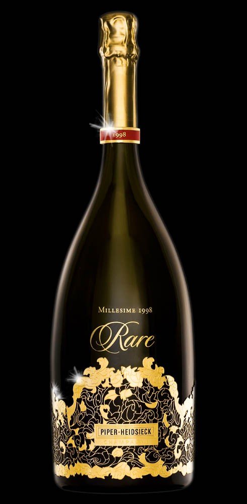
Some actual champagne bottle inspiration:


(I like the idea of having a glass/ice bucket coming with the bottle. I don't know if I necessarily like this packaging.)
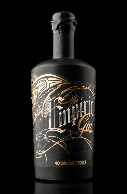


Tuesday, October 15, 2013

Chop Shop Typeface

Here is the alphabet and ad for the typeface that I created completely out of Barbie doll parts. 


Workspace

My workspace changes frequently. Mostly, this is because I don't ever really want to sit in the same place for hours because I have an old lady back. Today, I was taking advantage of the pretty weather and getting some work done out on my back patio. I like working in the middle of the day when there's still sunlight, because it gives me hope that I might be able to finish a project before 3am.


Oh man, I just realized all of the Hello Kitty that's in this picture. This is embarrassing. Anyway, I refinished this table this summer! I'm really proud of it.

Block of Type

This was on my walk home. I live close to Turner Field, in case you can't tell.


Thursday, September 26, 2013

Inspiration

There are a few design blogs that I check regularly for inspiration:

http://visual-poetry.tumblr.com/

Visual Poetry is mainly a typography blog, but what I love about it is that the type is always treated in an interesting way. Like this:
»a bra« by anatol knotekfrom my new book »2 4get her«[ homepage | tumblr | twitter ]


Visual Graphc is usually pretty fun. Sometimes the author of the blog goes off on rants about things that are uninteresting, but I mostly just scroll past that and look at the pretty pictures.


BeType has great typographic material that can sometimes be tongue-in-cheek so that's great.
DReam Shepherds,
i mean look at this. I'm crying it's so beautiful. 


And I'm sure many of you have seen this blog but http://beautifulswearwords.com/ 


And finally, to know you're not alone, you should also follow this blog: http://clientsfromhell.net/ 

It's full of great stories that you can either relate to or be so glad you're not dealing with.


Monday, September 16, 2013

Design Trends

Perhaps it's just a thing that bad pop albums have in common. It seems like the vintage-looking overexposed photo is really popular. But why? Why is this generally frowned upon photography style getting positive recognition? Personally, I'm going to blame it's popularity all of the fourteen year old girls that use the really terrible filters on Instagram (not saying that all Instagrammers are 14 year old girls, but you know where I'm coming from, right?)

Anyway, I don't think that this is a style that's going to last very long. I think that in order to appreciate this kind of work, you have to know what a "properly" exposed photo looks like. You gotta know the rules before you can break them, I guess is what I'm saying. 


And I doubt the majority of the Instagram community know the rules.


end rant


....wait no it's not.

Here's one more trendy thing:


I don't think I really need to talk about this piece since it literally says what I want to say. But here's the credit.