Thursday, September 26, 2013

Inspiration

There are a few design blogs that I check regularly for inspiration:

http://visual-poetry.tumblr.com/

Visual Poetry is mainly a typography blog, but what I love about it is that the type is always treated in an interesting way. Like this:
»a bra« by anatol knotekfrom my new book »2 4get her«[ homepage | tumblr | twitter ]


Visual Graphc is usually pretty fun. Sometimes the author of the blog goes off on rants about things that are uninteresting, but I mostly just scroll past that and look at the pretty pictures.


BeType has great typographic material that can sometimes be tongue-in-cheek so that's great.
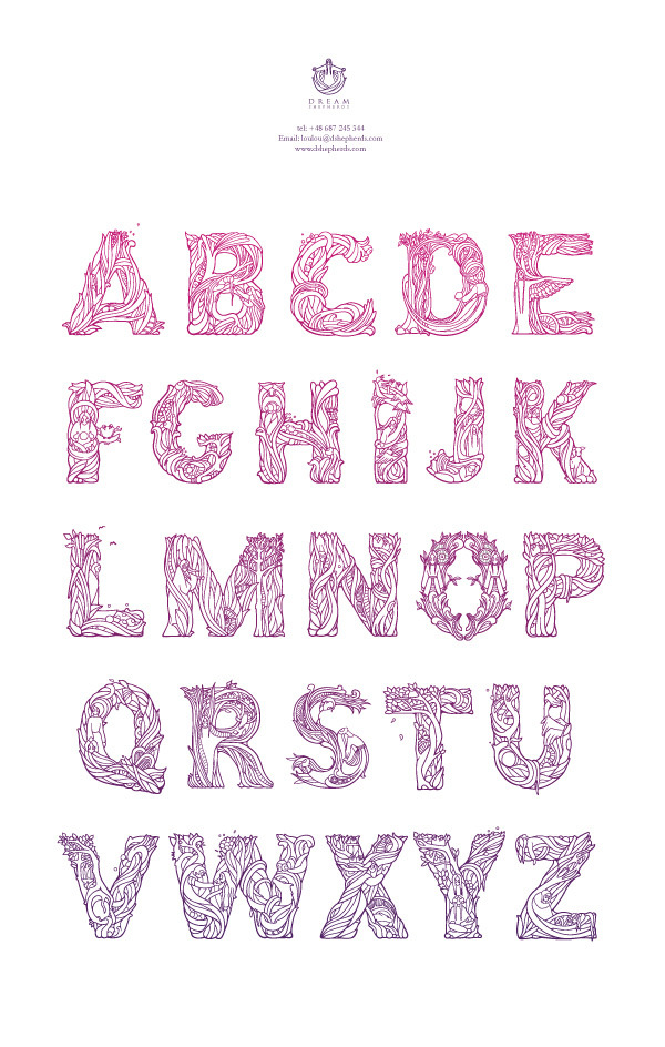
DReam Shepherds,
i mean look at this. I'm crying it's so beautiful. 


And I'm sure many of you have seen this blog but http://beautifulswearwords.com/ 


And finally, to know you're not alone, you should also follow this blog: http://clientsfromhell.net/ 

It's full of great stories that you can either relate to or be so glad you're not dealing with.


Monday, September 16, 2013

Design Trends

Perhaps it's just a thing that bad pop albums have in common. It seems like the vintage-looking overexposed photo is really popular. But why? Why is this generally frowned upon photography style getting positive recognition? Personally, I'm going to blame it's popularity all of the fourteen year old girls that use the really terrible filters on Instagram (not saying that all Instagrammers are 14 year old girls, but you know where I'm coming from, right?)

Anyway, I don't think that this is a style that's going to last very long. I think that in order to appreciate this kind of work, you have to know what a "properly" exposed photo looks like. You gotta know the rules before you can break them, I guess is what I'm saying. 


And I doubt the majority of the Instagram community know the rules.


end rant


....wait no it's not.

Here's one more trendy thing:


I don't think I really need to talk about this piece since it literally says what I want to say. But here's the credit.

Wednesday, September 11, 2013

September 11 Memorial Poster


Timeline & Selfie


I realize that this makes me sound angsty.


I've never actually fought anyone. Yet.

Good & Bad

Elastic Bands Open


Look at that clever typography. Ric Bixter

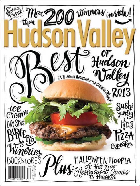
Hudson Valley (US)
Sweeeeet type on this new cover design Hudson ValleyHand-lettering by Angela Southern/Snyder New YorkPhotograph by Jennifer MayCreative Director: Robert SupinaEditor-In Chief: Olivia Abel

(I'm a sucker for hand lettering)
Photograph by Jennifer May
Creative Director: Robert Supina
Editor-In Chief: Olivia Abel


This is obviously the good design.


This was the (only!) image used in this handy article about how to make an effective club promotional flyer. 

Tuesday, September 3, 2013

Best of the Best!

Five pieces that I think are responsible for getting me into the graphic design program:


This is my ad campaign for Saba. This was my only piece that relied solely on illustration so I feel like I had to go all or nothing on this one. I am very happy with the end result. It conveys the art deco travel poster feel that I was trying to achieve.


 Event poster for a band called Why?. This piece is important because I actually created all of these elements outside of the software. Being able to physically make art is a much different process than slappin' some filters on a page. 

Expressive typography project. (This piece is readable when printed, fyi). I am proud of this project because I successfully conveyed the mood/feelings that were appropriate to each quote. This project was challenging since we were not able to include any sort of illustrations to help convey the thought process, so being able to accurately feel the meaning behind this piece through only type was an accomplishment for me.


These last pictures are apart of my Saba rebranding project. The paper bag is the direct mailer. The event that the mailer is promoting is a canned food drive and if you bring in canned foods, you get a lunch from Saba for free. (All of this is outlined on the insert, and on the back is the special menu for the Lunch for Lunch day). The last picture is the specialty project. I made custom Beer of the Month glasses and packaging for every season. I screen printed the design on all of the glasses with glass frosting chemically stuff.